Understanding the Importance of Tertiary Logos
Published: Dec 1, 2025Author: Admin
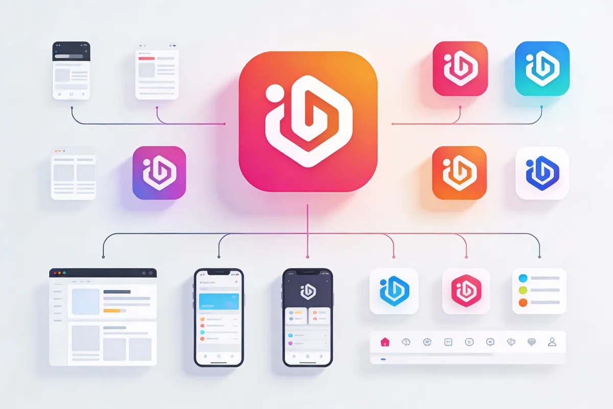
A tertiary logo is a simplified, flexible version of your brand’s mark—designed for tight spaces and digital touchpoints. This guide explains logo hierarchy (primary, secondary, tertiary) and why every modern brand needs a responsive logo suite for consistent visual identity.
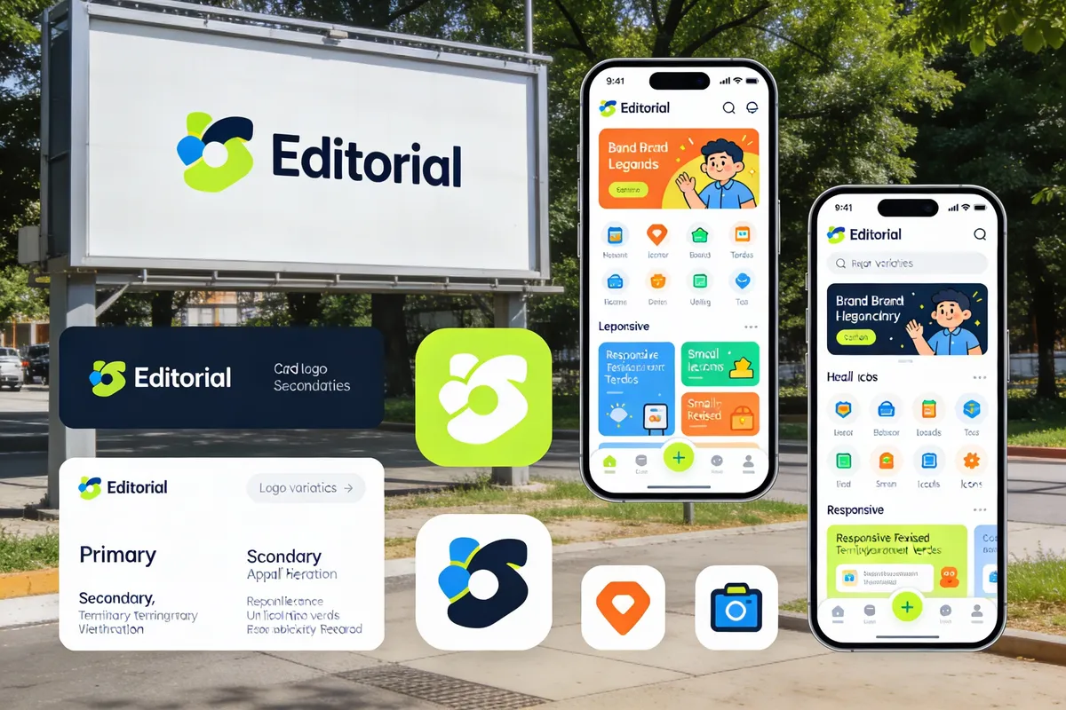
Logo hierarchy matters. A responsive logo package ensures your brand looks professional everywhere, from tiny mobile screens to highway billboards.
What Is a Logo Hierarchy?
A logo hierarchy is the structured system of logo variations a brand uses to adapt across different settings. It usually includes three levels:
- Primary Logo: The main, full-detail version. Used on large formats like websites, signage, or business documents.
- Secondary Logo: A more compact or rearranged version. Ideal for horizontal or vertical layouts, social media covers, or smaller print.
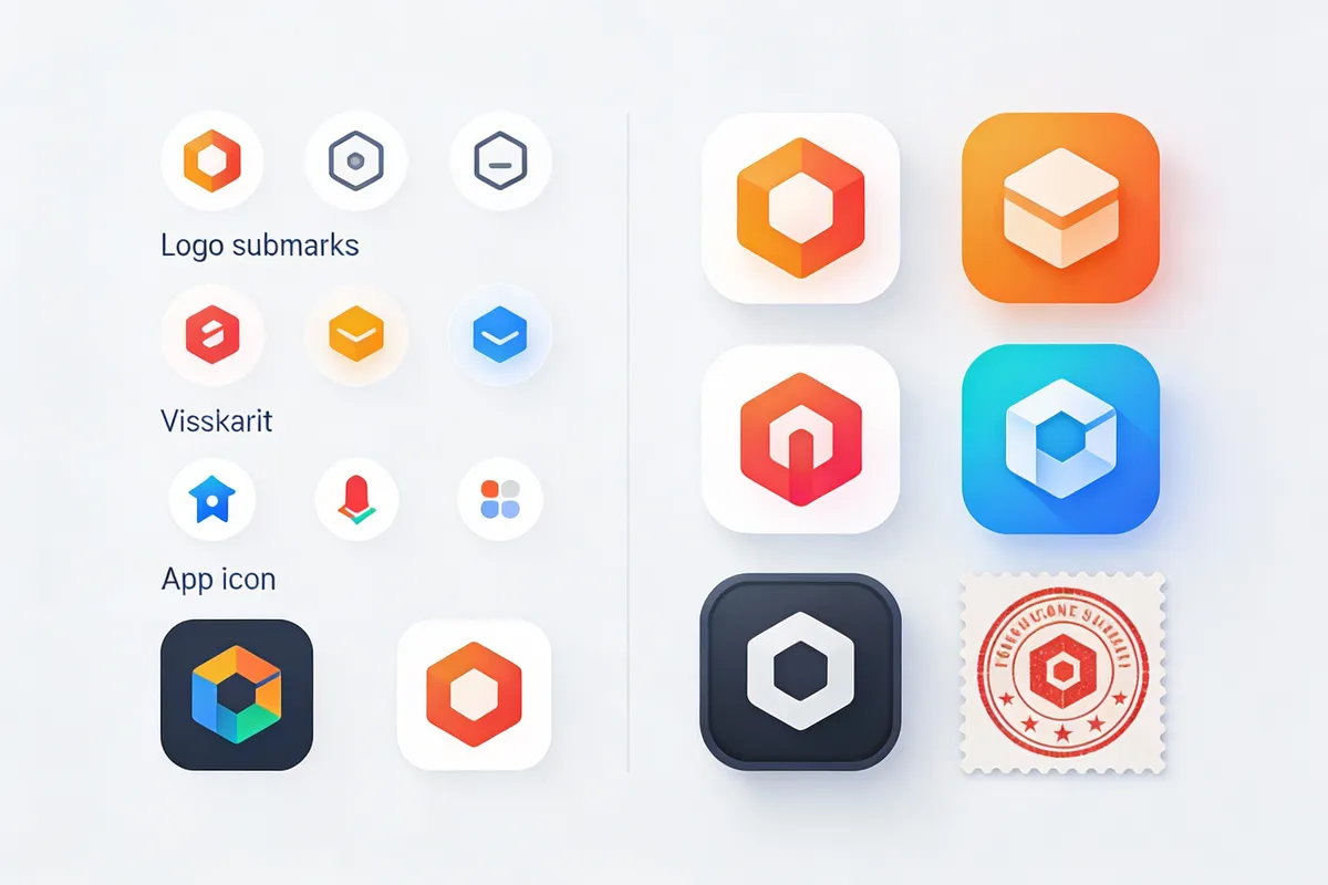
- Tertiary Logo: The simplest form, sometimes called a logo submark. Designed for small spaces—think profile icons, app badges, or website favicons.
Why Use a Logo Hierarchy?
- Consistency: Prevents off-brand visuals in different contexts.
- Flexibility: Adapts to both large and tiny spaces.
- Recognition: Maintains brand presence, even when only a symbol or initials fit.
Pro Tip: Build all three logo versions at the start of your branding process for easy, professional application everywhere.
Deep Dive: What Is a Tertiary Logo?
A tertiary logo (or logo submark) is a minimal, often abstracted version of your brand’s logo. It’s designed for highly restricted spaces where detail is lost, such as:
- Favicon in a browser tab
- Social media profile images
- Watermarks or small merchandise
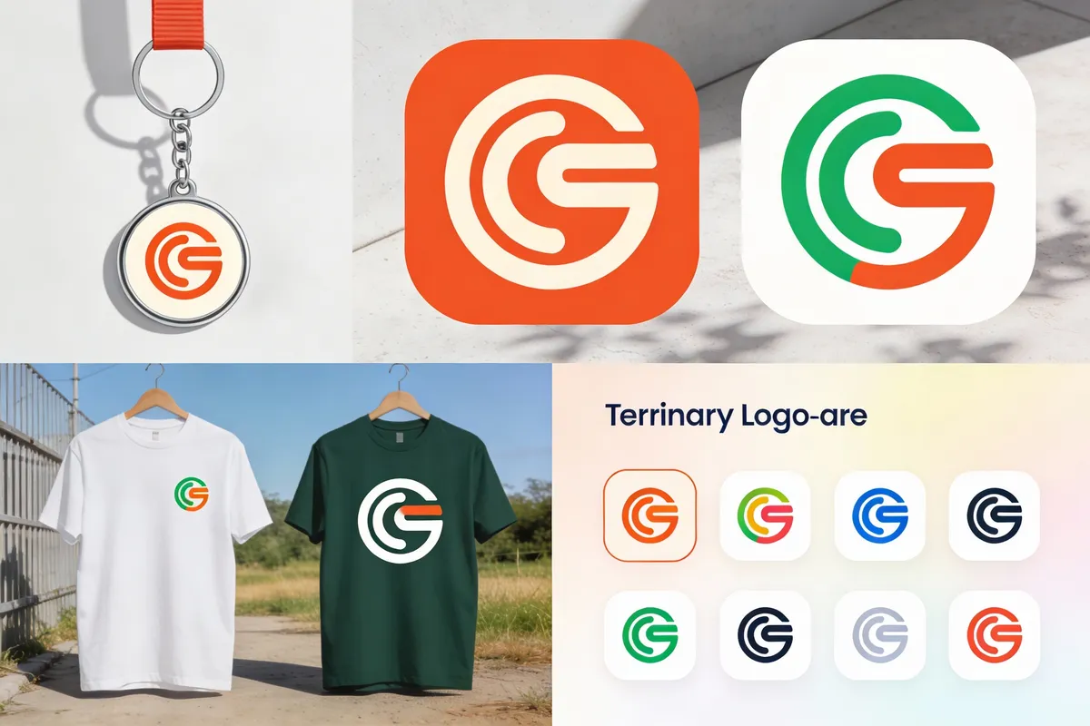
Characteristics of Tertiary Logos
- Highly simplified: May use just initials, a monogram, or a single icon.
- Circle or square format: Fits digital and print uses.
- Monochrome or limited color: Ensures clarity at small sizes.
Mini-case: A Café’s Logo Suite
A local café’s primary logo includes its name, tagline, and a coffee cup illustration. Its secondary logo drops the tagline and shifts to a horizontal layout. The tertiary logo? Just the stylized cup in a circle—perfect for social media avatars and cup stamps.
Why Your Brand Needs More Than One Logo
Modern brands interact with audiences everywhere: phones, tablets, packaging, digital ads, and storefronts. One logo design rarely fits every need.
1. Responsive Branding
A responsive logo package—primary, secondary, and tertiary—ensures your brand always appears clear and professional, no matter the surface or screen.
- Small screens: Tertiary logo keeps your identity sharp, even at 32x32 pixels.
- Large formats: Primary or secondary logos showcase full detail and personality.
Example: A fitness studio’s logo looks bold on a street sign (primary), adapts for social banners (secondary), and stays recognizable as a small app icon (tertiary).
2. Improved Brand Recognition
Repetition and consistency breed recognition. Using the right logo submark everywhere builds familiarity, even when space is tight.
- Social media: Submarks stand out as profile images and in comments.
- Merchandise: Compact logos work on mugs, pins, or stickers.
3. Professionalism and Versatility
Brands with a complete logo hierarchy look more established and trustworthy. This versatility is a hallmark of top brands, from tech startups to local bakeries.
Creating a Responsive Logo Package: A Step-by-Step Framework
The “Three-Tier Logo System” is a simple process for beginners and small businesses:
- Design your primary logo: Full brand name + icon.
- Rework for secondary logo: Adjust layout (stacked/horizontal), simplify details.
- Extract a tertiary logo: Use a symbol, initial, or monogram.
Tip: Online design tools and AI logo generators offer instant previews of each version. Test your logos on mockups (business cards, apps, merchandise) before finalizing.
Practical Scenario: Updating an Existing Logo
If you already have a logo but not a full hierarchy:
- Identify your core symbol or initials.
- Redraw as a simple icon for the tertiary logo.
- Rearrange elements for a secondary, space-efficient version.
Tertiary Logo Best Practices
- Keep it simple: Overly complex details won’t survive at small sizes.
- Test for legibility: Shrink your submark to 16x16 pixels to check clarity.
- Stick to brand colors: Use your established palette for consistency.
- Use vector formats: Ensures sharpness at any size.
Real-World Inspiration: Brands Using Tertiary Logos
- Instagram: Camera glyph inside a gradient circle for app icons.
- Starbucks: The siren symbol stands alone, no wordmark needed.
- FedEx: “Ex” symbol for mobile apps and favicons.
These brands reinforce identity with tertiary logos that work everywhere.
FAQ: Tertiary Logo Essentials
What is a tertiary logo?
A tertiary logo is a simplified, minimal logo version for small or digital spaces.
- Often a symbol, icon, or initial
- Used for favicons, app icons, and profile pictures
How is a tertiary logo different from a secondary logo?
A secondary logo is a rearranged or cropped version for flexible layouts; a tertiary logo is the most minimal, for tiny spaces.
- Secondary: for headers, banners, or smaller print
- Tertiary: for icons, stamps, and watermarks
Why does my brand need a tertiary logo?
A tertiary logo maintains brand recognition in micro-spaces where your main logo won’t fit.
- Ensures clarity at all sizes
- Strengthens visual consistency
Can a logo submark be used as a watermark?
Yes. Logo submarks are ideal for watermarks due to their simplicity and small size.
- Discreet branding
- Works on photos and videos
Conclusion: Set Your Brand Up for Every Screen and Surface
Building a logo hierarchy—including a tertiary logo—is an essential step for any brand aiming for professional, consistent, and future-proof visual identity. Responsive branding isn’t just for big companies. It’s for any business wanting to look polished on a smartphone, a coffee cup, or a billboard.
Actionable next steps:
- Sketch out your brand’s primary, secondary, and tertiary logos.
- Test each on real-world mockups.
- Use online tools to generate and refine your logo suite—share with your team for feedback.
A strong logo system adapts, grows, and keeps your brand looking its best everywhere.
References
- https://99designs.com/blog/logo-branding/logo-variations/
- https://www.smashingmagazine.com/2016/07/responsive-logo-design-guide/
- https://www.canva.com/learn/logo-variations/
- https://www.creativebloq.com/inspiration/the-best-responsive-logos
- https://www.adobe.com/creativecloud/design/discover/logo-types.html