Wordmark vs Symbol Logos: Choosing the Best Style for Your Brand
Published: Dec 15, 2025Author: Admin
Introduction
When it comes to building a strong visual identity, the debate of wordmark vs logo is central for every brand owner. Should you choose a text-only logo like Google, or an iconic symbol like Apple? This guide compares wordmarks and symbol logos so you can confidently select the best style for your business.
Learn the pros, cons, and practical applications of wordmarks versus symbol logos, with expert tips to help you pick the right style for your brand’s identity.
Understanding Logo Types: Wordmarks and Symbol Logos
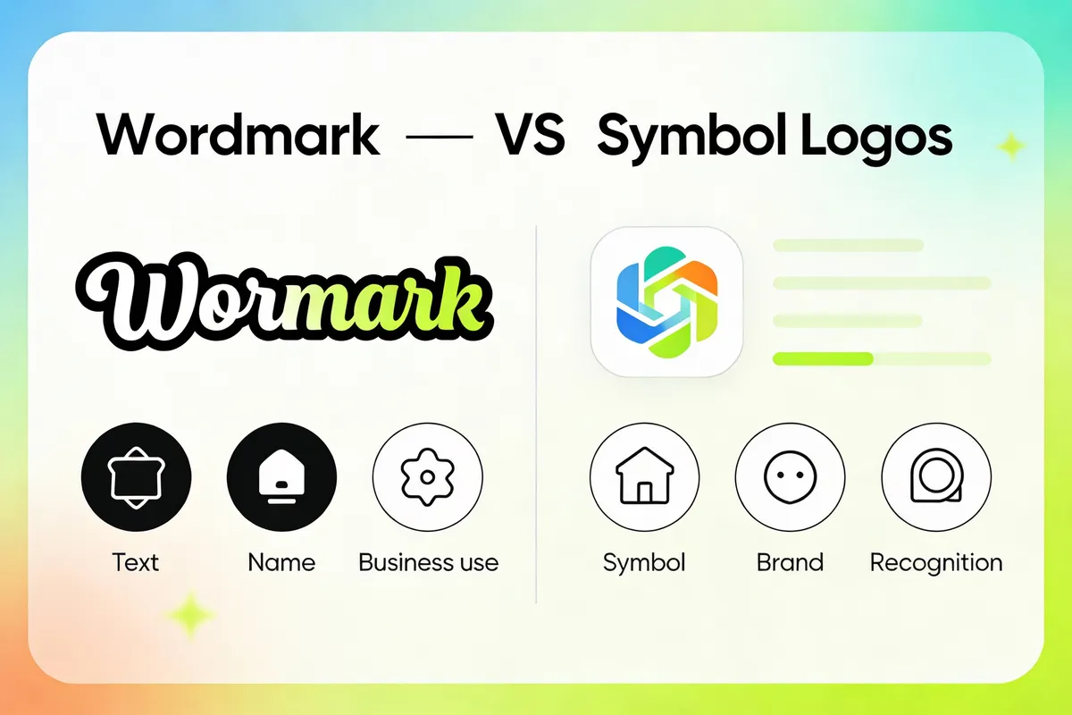
A brand’s logo is its visual handshake. Two of the most recognized styles are wordmarks and symbol logos. Here’s a breakdown:
- Wordmark (Text-Only Logo): A logo that consists of the brand’s name in a stylized typeface. Example: Google, Coca-Cola.
- Symbol Logo (Icon or Brandmark): A logo using a symbol or icon, often without any text. Example: Apple, Nike swoosh.
- Combination Mark: A blend of both text and symbol. Example: Adidas, Burger King.
 and Apple (symbol), clean, modern style.")
Why the Distinction Matters
Choosing between these logo types isn’t just about aesthetics. The right style can influence:
- Brand recognition and recall
- Versatility across platforms
- Emotional connection with your audience
Understanding these differences sets the foundation for your decision.
The Case for Wordmarks: Clarity and Versatility
A wordmark is straightforward: your brand name, crafted in a unique style. This approach is especially effective for new businesses or those with distinctive names.
Advantages of Wordmarks:
- Immediate Brand Recognition: Your name is front and center; no decoding required.
- Universal Application: Works well on websites, packaging, signage, and merchandise.
- Easier Legal Protection: Unique typographic treatments of your business name are easier to trademark.
Case Example:
Google’s text-only logo is recognized worldwide. Its simple, colorful typeface communicates friendliness and approachability, making the brand accessible to all ages.
Tip: If your business name is short and memorable, a wordmark can enhance recall and professionalism.
When to Use a Wordmark
- Your brand is new and needs to build name recognition.
- You have a unique or catchy business name.
- You need a logo that scales well from social icons to storefronts.
Pro Advice:
Test your wordmark at small sizes (like app icons) to ensure legibility. Simple fonts work best.
The Case for Symbol (Icon) Logos: Memorability and Flexibility
Symbol logos use an image or abstract icon to represent a brand. They can quickly convey meaning and are often recognized at a glance.
Advantages of Symbol Logos:
- Universal Appeal: Symbols transcend language barriers.
- Visual Impact: Well-designed imagery can evoke emotion and tell a story.
- Great for Digital: Icons scale well for app icons, favicons, and avatars.
Case Example:
Apple’s logo is just an apple with a bite taken out. It’s instantly recognizable across cultures and media, even with no words.
Tip: If your brand operates globally or appeals to diverse audiences, a symbol can communicate faster than text.

When to Use a Symbol Logo
- Your brand aims for international appeal.
- Your business name is long, generic, or hard to pronounce.
- You want a logo that can stand alone as a visual shorthand.
Pro Advice:
Start with a combination mark (icon + text) and phase out the text as your symbol gains recognition.
Combination Marks: The Best of Both Worlds?
Many successful brands use combination marks—a wordmark paired with a symbol. This approach provides flexibility across different media and contexts.
Why Consider a Combination Mark:
- Versatility: Use the full logo for formal materials, the symbol alone for avatars or app icons, and the wordmark for signage.
- Gradual Brand Recognition: Over time, you can drop the text or icon as your audience becomes familiar with your brand.
Mini-Case:
Nike’s original logo included both the “Nike” name and the swoosh. Today, the swoosh alone is enough for global recognition.
Framework: The 3C Logo Decision Model
- Clarity: Does your audience need to know your name immediately?
- Culture: Does your brand serve a global or local market?
- Consistency: Can your chosen style work across all platforms?
Evaluate each “C” to guide your logo style choice.
Logo No Words: When Pure Symbolism Wins
There are times when a logo no words approach is most effective. Think of brands like Twitter (the bird) or Shell (the shell). Here’s when to go text-free:
- Iconic Simplicity: Your symbol is so unique, it stands alone.
- Mobile-First Needs: Small screens favor icons over detailed text.
- Emotional Branding: Symbols can evoke feelings faster than words.
Scenario Example:
A children’s toy brand uses a playful animal icon as its logo. Kids and parents recognize it instantly on shelves—no reading required.
Tip: If you choose a symbol-only logo, invest in professional design to avoid confusion with other brands.
Practical Steps to Pick the Right Logo Style
Selecting between a wordmark, symbol, or both doesn’t have to be daunting. Here’s a step-by-step approach:
- Assess Your Brand Name: Is it unique? Short? Easy to spell?
- Study Your Audience: Are they local or global? Young or mature?
- Audit the Competition: What logo styles do similar businesses use? How can you stand out?
- Test in Context: Mock up your logo on real materials—business cards, websites, social media.
- Gather Team Feedback: Use shareable design links to get input from colleagues or customers.
Pro Advice:
Many online design tools and logo packages (including those with AI-generated options) let you preview multiple styles side by side—take advantage of these features to make an informed choice.
FAQ: Wordmark vs Logo
What is the difference between a wordmark and a logo symbol?
- A wordmark is a text-only logo, while a symbol uses an icon or image.
- Wordmarks spell out the brand; symbols are visual representations.
Can I use both a wordmark and a symbol logo together?
- Yes, this is called a combination mark.
- Many brands start with both and later use just the symbol or wordmark.
Is a text-only logo effective for small businesses?
- Yes, if your name is unique and easy to remember.
- Text logos are simple, versatile, and cost-effective.
How do I decide between a symbol and a wordmark?
- Assess your brand name, audience, and competition.
- Test both styles for versatility and recognition.
Conclusion
Choosing between a wordmark vs logo style is a foundational step in shaping your brand’s identity. Wordmarks offer clarity and name recognition, while symbol logos deliver universal appeal and memorable visuals. Many brands benefit from a combination approach—starting with both and evolving as recognition grows.
Action step: Use the 3C Logo Decision Model (Clarity, Culture, Consistency) to evaluate your needs, and test your logo in real-life scenarios before making your final choice. With the right style, your brand’s visual identity will connect, communicate, and endure.